Seven Illustrated Principles of Highly Informative Color
by Bob Stein,
December 2000
<!--Colorize your hard-won mental models so your users gain them with ease.-->
 Want to communicate a lot in a small space? Or a small attention
span? What snags the intuition faster than a speeding monosyllable?
Color!
Want to communicate a lot in a small space? Or a small attention
span? What snags the intuition faster than a speeding monosyllable?
Color!
"And what tremendous
possibilities for the variation of meaning are offered by the combinations
of colors."
—Paul Klee, 1945
The human mind works wonders searching, discriminating and comprehending when given the right visual cues. Here are some ways I've found to take advantage of color to ease the tedium of complexity.
1. Consistency. If your work is infused by an all-important theme, there will be numerous chances to reveal it. You'll have a lot less explaining to do if you exploit each one the same way.
2. Moderation in color diversity. The power of color to inform fades fast without restraint. Two themes are a lot to try to colorize. Bring what's most important front and center with judicious use of color. Decorative color must play at best a subdued role.
On the right is a 3-color theme. Wherever I used this theme, it monopolizes the color—almost all other information is in black, gray and white. This work actually has two major informative color themes and one minor one, but their diversity never overlaps: wherever one varies the others never do. And where any mixture occurs at all (not shown here) one theme clearly dominates.
These principles of consistency
and moderation are at tension with one another. To clarify, I don't
suggest moderation within a theme at all: I'd consistently colorize
everything you could. Rather: moderation between color themes. The only colors that
should vary
within any section are those from a single
theme.
| Next >>> | |
| Choosing the Colors |

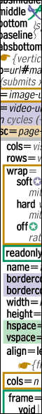
 Example
1: This symbol indicates a clash between Internet Explorer and
Netscape. It appears next to any feature that acts differently in the two
browsers. (Bugginess is a different symbol.) It's an icon of two swords, one in IE color, the other Netscape
color. An unusual use of the colors to indicate an unusual situation. This
one symbol lumps many special cases together, each one of which then I
Example
1: This symbol indicates a clash between Internet Explorer and
Netscape. It appears next to any feature that acts differently in the two
browsers. (Bugginess is a different symbol.) It's an icon of two swords, one in IE color, the other Netscape
color. An unusual use of the colors to indicate an unusual situation. This
one symbol lumps many special cases together, each one of which then I 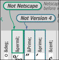 Notice
the strong visual availability of verbal help — sound bites bold and
surrounded by the forms they're explaining. Verbose descriptions are right
next door (though cut off here).
Notice
the strong visual availability of verbal help — sound bites bold and
surrounded by the forms they're explaining. Verbose descriptions are right
next door (though cut off here).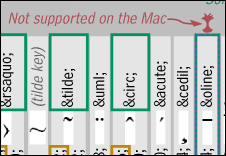 Example
3: I introduced a new symbol and color to indicate character non-support
by the Apple® Macintosh®, a twist needed only in the character section
of the reference (not in the tags or styles sections). Because that symbol
is used repetitively though, I think users unconsciously forgive the
mental intrusion of a new color and symbol.
Example
3: I introduced a new symbol and color to indicate character non-support
by the Apple® Macintosh®, a twist needed only in the character section
of the reference (not in the tags or styles sections). Because that symbol
is used repetitively though, I think users unconsciously forgive the
mental intrusion of a new color and symbol.