Color Card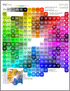 (8.5" x 11") |
Color Chart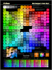 (18" x 24") |
Printed
color references with color deficiency simulations |
 Toward the lower left
on the Card and the
Chart is a simulation
of deuteranopia,
a common variety
of color blindness.
Toward the lower left
on the Card and the
Chart is a simulation
of deuteranopia,
a common variety
of color blindness.
This doesn't mean that greens are invisible to people with deuteranopia. Human vision is complicated.
The role of the green cones is less to detect green light than to distinguish it from red. Similarly, when the red cones "don't see" (protanopia), the main consequence is that reds, yellows and greens are indistinguishable.
 This figure simulates the web-safe
colors as they appear in a deuteranopic condition. In most other
categories of color blindness,
protanopia, protoanomaly and
deuteranomaly, the view is very
similar but there are subtle
differences. In one very rare form, called tritanopia,
affecting thirty people
in a million, colors appear very differently. The Color-deficient vision site
excels at
explaining and illustrating these points.
This figure simulates the web-safe
colors as they appear in a deuteranopic condition. In most other
categories of color blindness,
protanopia, protoanomaly and
deuteranomaly, the view is very
similar but there are subtle
differences. In one very rare form, called tritanopia,
affecting thirty people
in a million, colors appear very differently. The Color-deficient vision site
excels at
explaining and illustrating these points.
 Here is
the main web-safe color
reference in the Card and the Chart.
Here is
the main web-safe color
reference in the Card and the Chart.
In most forms of color blindness, these colors appear similar to those above. When designing a web site, you might try to avoid depending on distinctions that color-blind people cannot make. About 8% of men and 0.4% of women have some form of color blindness.


 Ishihara Test for Color
Blindness
Ishihara Test for Color
Blindness Color Vision Testing Made Easy
 Professor
Holmgren’s Test For Color Blindness
Professor
Holmgren’s Test For Color Blindness