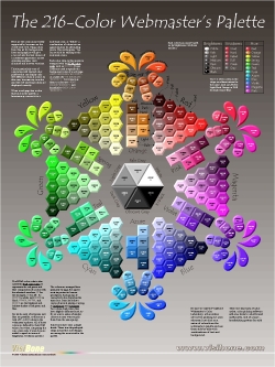
Default swatch collection for
Adobe ImageReady.
Striking but incomplete.
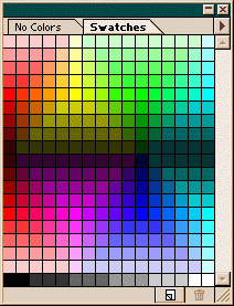
Lynda Weinman's browser-safe
swatch collection. Complete but
jumbled.
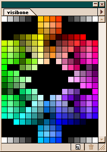
VisiBone's swatch collection.
The default swatch collection that comes with Adobe ImageReady has only 156 of the 216 web-safe colors. I discovered this when a graphics designer acquaintance of mine politely suggested there wasn't much need for my online color lab because most software has the web-safe palette built in, pointing to ImageReady as an example. Turns out he's 72% right. All of the most vivid or fully saturated colors are included in the factory-issue color picker, but many subtler shades are missing. Technically speaking, the missing colors are all those with HTML color codes made up of 33, 66, 99, CC, with no 00's nor FF's, such as CC6633, except for the grays, which are included.
Lynda Weinman has written several books on web colors and her swatch collection is ubiquitous, appearing even in Adobe Magazine. But it's in numerical order, which isn't much use to anyone but computer nerds. Try the Show Me The Browns Test: find two shades of brown that don't clash. Browns are subtle. Tasteful designers could use a hand here.
It was a series of miscommunications on the Adobe user-to-user forums that spurred me to action. (Sorry for not reprinting the messages, but I haven't heard back from the Adobe folks and, well, I'd rather lawyers stayed in their coffins. You can register and see it; topic 26 in the ImageReady forum.) I wanted a color picking tool that worked within Adobe software that had all the web-safe colors arranged symmetrically by hue, in line with the way humans perceive color. I got busy and hammered the arrangement I'd developed for a poster into this 16-column-wide grid. I hope you'll be able to make use of it when picking out your next great web site color scheme.
Downloadable swatch collections for Adobe software, including ImageReady and Photoshop:
VisiBone.aco color swatches for Adobe software on PC's.
visibone.sit color swatches for Adobe software on the Mac, provided in Stuffit format to retain the resource fork (conversion courtesy Joe Gillespie, host of WPDFD).
Tip: to make these swatches come up automatically each time you run ImageReady, you can rename VisiBone.aco to default.aco. This isn't necessary in Photoshop — just put VisiBone.aco in the same directory as default.aco (you'll see where after you hit the arrow). Note: I'm embarassed by the loosey-goosey nature of these instructions. If anyone can try these on a Mac or with Photoshop and help me get this precise I'd be very grateful. |
 |