Usability Analysis: E-Commerce Order Points
[[[900 words, 16 embedded images —Bob Stein, stein@visibone.com]]]
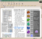
If you look down the left-hand column at the pages reduced to 20% original
size, your conscious eye can see
things that would normally register only subliminally. Without verbiage to distract the
left-brain, see where the right-brain's gaze is drawn. The second column shows
excerpts of where users are supposed to click to order.
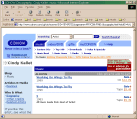
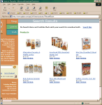
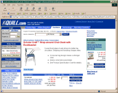
Order Page,
Bird's Eye View
Here are some high power
e-commerce order pages.
Notice where the
subconscious eye is drawn. |
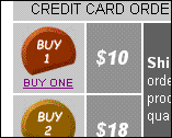
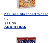
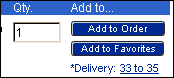
The All-Important
Order Click-Point
Here's a close-up of the spots
where all the fortunes and
livelihoods rely on users taking
action. No click, no gain. |
|
 |
 |
Note the bold break with a conservative color scheme to yank the eye
toward the order buttons.
The price is relatively far from the order point on this page.
|
 |
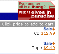 |
Note the gratuitous verbal clues as to where to click to lay one's money
down.
Of course, users would be foolish to purchase this obscure album (by
little-known artist Cindy
Kallet). No, the discerning user would much prefer having sex
with elves. Brought to you courtesy of BANNERNOW
oops I mean CDNOW. This order page
had the closest proximity of all of price to order point: a hyperlinked
price. |
 |
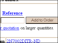 |
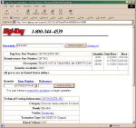
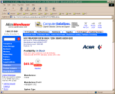
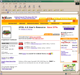
There isn't much to draw the eye to this unpretentious order point, a rare non-graphics
order button on the nerdly Digi-Key electronics parts order form. Note however that the company name
stands out well. The link below the button gives product details in
PDF. Above and to the right is the price/quantity breakdown. |
 |
 |
Shrewd use of orange stimulates appetite at this health food-ordering
site. You would want users to be hungry in order to find the order point. |
 |
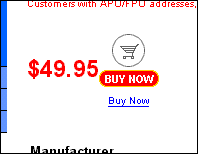 |
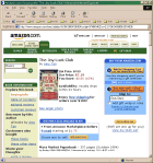
Note, from the bird's eye view the unmistakable red attraction spots in the company name
and at the order point. Note also the gratuitous use of white space around
the order point. Impulse buyers of obscure computer components must surely
be compelled. This is the only site I found with dual graphics
and text order points. Also unique in the enlarged price. Almost all others
shrank it. |
 |
 |
Here again, the bird's eye view clearly reveals a subliminal attraction
toward the order point, which is simple, brief and direct. |
 |
 |
The order buttons have very faint lizard-brain attraction but not
as much as the product description and price
in red, or the nav bars in
electric blue. Or the related purchase
box, which has prices and order buttons
of its own in fact! I am sure people often order the wrong product at this
site, thinking the price and order buttons in the box on the right apply
to the product on the left. |
I confess to some serious throwing-up-of-hands here. I went through this
exercise to find out what successful e-commerce sites had in common in the way
of visual cues. Must be successful for a reason. And all that success is bound
to influence some consistency, right? Well it sure seems to me these order pages
have hardly anything in common. Well there is something resembling a left-hand
navigation bar, as Erica
Nelson recommends. But the layout of price, quantity, description and order
click-point are all over the map. I'm aghast at all this diversity on arguably the
most critical focal point in all of web design: closing the sale. I'm not
ranting, just darn perplexed. (As you'll see below, ranting would be
hypocritical.)
Perhaps this reflects market diversity, user technical depth, impulsiveness,
return-purchases. What I fear is that it reveals an unsettling diversity in
designer whim. Or perhaps the diversity in the tools and skills needed to create
and maintain online sales. I wonder whether this can persist, or whether some
kind of uniformity will emerge, some conventions to make purchasing online a
little more consistent and less tedious.
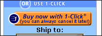
My impetus for this research was to improve the usability of my own order
page. Two customers in the last two months have mentioned they couldn't figure out where to click to order.
Few wake-up calls are as rousing. I thought my page had some pretty good
subliminal attraction already. But one customer said she thought the buttons
were just decoration, not clickable. So I added text links below each order
button and "CREDIT CARD ORDER BUTTONS" above. Here's the current order page
for the HTML Card:
I think I may have found the answer I was after. Divining the truth behind
user feedback is a Zen feat. Every complaint is a riddle, a perversely twisted
clue to significant usability improvement. "The customer is always
right." is of course literally false, but figuratively it captures some profound wisdom.
It wasn't until I wrote this article that the obvious finally dawned on me.
In every order page I saw, the order buttons were within one screen from the
top. Users did not have to scroll down to order. If you look at the 20%
screen-shots on the left very closely you can see the scrollbar on the
right-hand side. My order page is scrolled down. None of the seven test cases
are.
That's something I'll definitely have to correct when I have the courage to do the order
pages over.